


Dopamine Decor Colors: Choosing a Palette That Holds Together
People assume a colorful room fails because the colors were too bright. It is usually the opposite problem. The colors were fine individually and had no relationship to each other.
Color theory gets taught as a wheel, which is accurate and not much help when you are standing in a living room. What follows is the version we use when we are building a colorway across a rug, a pillow and a throw and need them to look like they belong together.
Take the palette from one object
The fastest reliable method is to stop inventing a palette and steal one. Find a single object with colors that already work together and use it as the source. A rug, a piece of art, a textile you brought back from somewhere, a book cover.
Somebody already solved the problem in that object. A hand-tufted abstract has five or six colors in a proportion that a person tested, and those proportions matter as much as the hues. If a rug is mostly cream with a lot of rust and a little cobalt, your room should be mostly cream with a lot of rust and a little cobalt.
That proportion rule is the one people skip. They take the five colors and use them in equal amounts, which flattens the whole thing.
A worked example
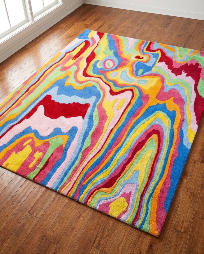
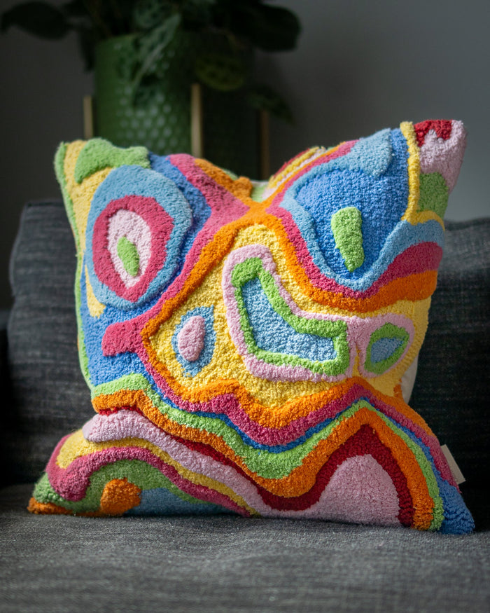
Take Bellows, since we know exactly where it came from. Dani Klarić painted it as a film case for a camera store, and the three colors carrying it are bubblegum pink, periwinkle blue and light yellow, sitting on a lighter ground.
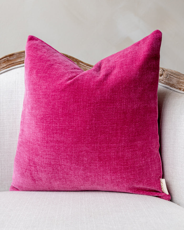
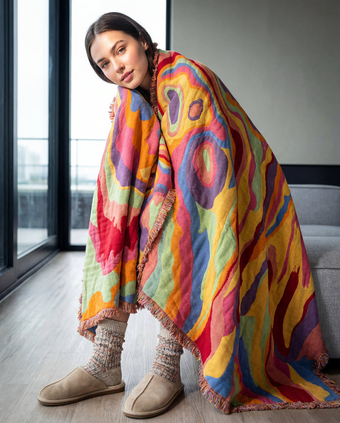
In a room, that becomes: the rug on the floor holding all three. Pink repeated in a velvet pillow and nothing else. Periwinkle repeated in a throw over the chair arm and in the mat of a framed print. Yellow appearing exactly twice, small, because yellow at full strength will take over a room if you let it.
Walls stay off-white. Sofa stays neutral. The palette is already decided and the rest of the room is just executing it.

Shop this look
Two rules that do most of the work
The first: one color leads, one supports, one interrupts. The lead covers the most surface. The support shows up in a few mid-size places. The interrupter appears two or three times in small doses and is usually the color you would not have picked on your own. A mustard in a room of blues and greens. A hot pink in a room of rust and cream.
The second: repeat every color at least twice. A color that appears once looks like an accident. The same color in two places across the room looks deliberate, even when the two objects have nothing else in common.
Start on a board, not in the room
Dani begins every project with a mood board before anything else gets decided: photographs, textiles, a color range, then layouts. It is a good habit for the same reason a shopping list is a good habit. Deciding the palette in advance stops you buying the fourth thing that was lovely in isolation.
You do not need software. A pinboard, or a flat surface with the rug swatch, a pillow cover and a paint chip sitting next to each other in the actual room light, will tell you more than any app.
Warm and cool, and why your room already decided
A south-facing room gets warm light most of the day and will push everything warmer. North-facing rooms run cool and blue-grey, which flatters cool palettes and can make a warm terracotta look muddy.
Fighting the light is possible with bulbs and lamps, but it is easier to pick with it. In a north room, greens, blues and clean pinks stay clean. In a south room, rust, ochre, olive and warm red get richer through the afternoon.
Check any large purchase in the room at two times of day before deciding it is wrong. Most of the returns that come back to us as "the color was different" are really the room's light doing what it was always going to do.
The colors that are hardest to place
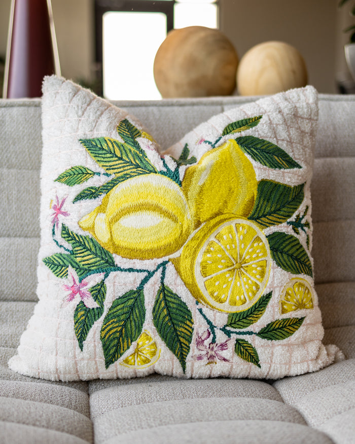
Bright pure yellow is the one most people want and most often get wrong, because at full saturation it dominates anything near it and goes green under warm light. It works better as a small interrupter than as a lead. A lemon embroidery on a pillow does the job. A yellow sofa is a commitment.
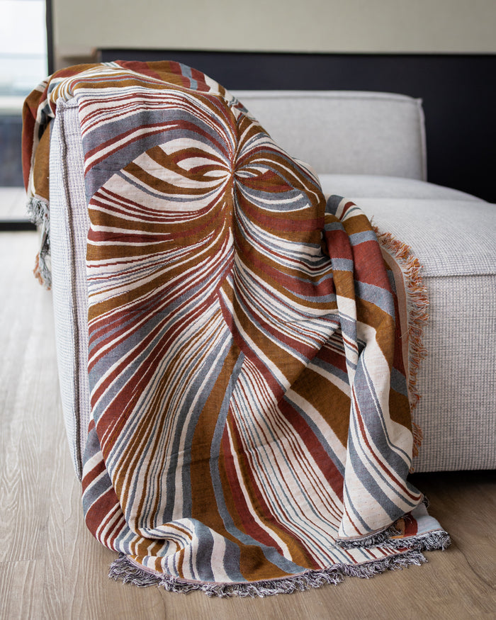
True red is similar. Tomato and rust versions of it are far easier to live with, which is why so much of what we make sits in that band.
Black is worth mentioning, because a colorful room usually needs some. A small amount of black or very dark brown gives the eye a reference point and makes every other color read as more saturated. Picture frames, a lamp base, a line in a pattern. Without it, bright palettes can feel washed out.

Shop this look

Pastels count
Dopamine decor is not required to be loud. A palette of clean pastels, pushed to real saturation rather than the chalky nursery versions, does the same job. Soft pinks, sage, butter, pale cobalt. The rules do not change: one leads, one supports, one interrupts, and everything repeats.
If that is closer to your taste, we wrote it up as minimalist dopamine decor.
When it is not working
Almost always one of three things. Too many leads, meaning three or four colors are all competing for the most surface. No quiet surface, meaning there is nowhere for the eye to rest. Or a color appearing exactly once.
Take something out before you add anything. A room with a color problem rarely gets fixed by another purchase.
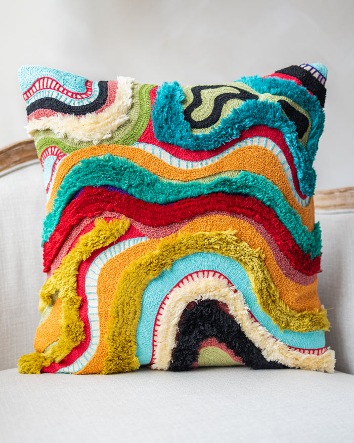
If you want to start from a palette that already resolves, the abstract colorways in dopamine decor run across rugs, pillows, poufs and throws.
Keep reading
Dopamine Decor


Dopamine Decor
Color you can put down and take with you
Hand-tufted abstract rugs, embroidered throw pillows and tapestry blankets in organic cotton and wool.
Shop dopamine decor